What’s With Those Big Hillside Initials?
Giant capital letters adorn hillsides near many cities and towns in the American West. These letters, typically constructed of whitewashed or painted stones or of concrete, are cultural signatures. They serve as conspicuous symbols of community and institutional identity, and they represent an idea, perhaps traceable to a single point of origin, that diffused quickly and widely early in this century. The letters are distinctive vernacular landmarks in the western states, rarely occurring elsewhere.
Both environment and culture have affected the distribution of those hillside monograms. An accessible and fairly steep slope, undeveloped and preferably treeless, is the first requisite. If it is public land, such as Forest Service, Bureau of Land Management, park, or school property that is protected from urban encroachment, so much the better. Many western communities can meet these requirements admirably.
Hillside symbols have a surprisingly respectable history dating back some eighty years. To a remarkable extent the letters can be traced to a single decade, 1905-1915. They have almost always been built and maintained by college or high-school student groups. The earliest letter-building projects were devices for defusing increasingly violent inter-class rivalries, which college administrators and faculty found difficult to control. It apparently worked. Making a letter was often a gala community event, an organized "men's workday" declared a formal school holiday, with picnic lunch and supper provided by campus women.
Once built, letters quickly became symbols of community and school, instant traditions shouting "Here we are!" Illuminating them before major sports contests or for homecomings began early. At such times, when tensions between rivals ran high, the letters were prime targets for raids so they were zealously defended through the night with bonfires and beer.
Their maintenance, including the annual whitewashing or painting, has often been an important ritual in campus life. In some areas the letters had a second function in earlier days as navigation aids to aircraft pilots, helping them identify look-alike desert towns.
“Big C” Granddaddy of Big Initials
The University of California's "Big C" on the Berkeley hills is the granddaddy of them all. Only seventy feet high, the Berkeley letter has been dwarfed by many others over time, but it has persisted. It was built by the freshman and sophomore classes over two rainy days in the spring of 1905 and finished in time for official recognition at the annual Charter Day celebration. The traditional brawl between the two classes had degenerated into something close to guerrilla warfare, a kind of primal savagery known as "the rush" that was likened by one contemporary to Anglo-Saxon raids on the British coast. The intramural battles were receiving increasingly lurid press coverage, discrediting the university throughout the state. Legislative appropriations and alumni giving were threatened. In a well-publicized truce, the classes of '07 and '08 agreed to end the rush and instead devote their energies to constructing a masonry C on the steep, grassy slope behind the campus. Maintaining the six-inch-thick slab of concrete, painted yellow, was a job assigned to succeeding freshman classes.
There is no apparent precedent for the Big C. Announcement of the plan to build it brought a storm of community and faculty protest. Opponents denounced it as unworthy of the university, claiming it would "for all time disfigure the sensuous beauty of the hills," and would "slide and become an eyesore." The color yellow "wouldn't harmonize." The mathematics professor A. W. Whitney protested that "living in contemplation of this kind of vulgarity students would soon be painting C's on Yosemite's El Capitan. And why not? Why is it worse? The Berkeley Hills in their way are just as fine as Yosemite.... One thousand times as many people look on them....They front on the Orient....Our wantonness would be in the eyes of the world. We cannot afford to stand for such vulgarity." Charles Mills Gayley, the distinguished professor of English literature, had an alternative: "A great C of acacia trees, with their burst of golden spring bloom. Or something else, anything." Both the influential Hillside and the Town and Gown clubs protested by petition. The C would offend many of their members, citizens who had long been loyal friends and benefactors of the university.
But others were supportive, especially the engineering and architecture faculties and the emerging athletic establishment. They saw the C as a symbol of conciliation that would also celebrate "the love and loyalty in the heart of every Californian." The renowned campus architect John Galen Howard gave encouragement, counseling how to line up the letter with the axis of the campus plan.
The first summer the C was damaged by dynamite, perhaps in one of the earliest instances of eco-radicalism. The letter was immediately seized as a target by rival schools. It was hallowed in the school song: "On our rugged eastern foothills stands our symbol clear and bold, Big C means to fight and strive and win for Blue and Gold." Today the letter stands below the big industrial complex of the Lawrence Berkeley Laboratory, inconspicuous and shielded from all but direct view by groves of eucalyptus and Monterey pines.
College Craze
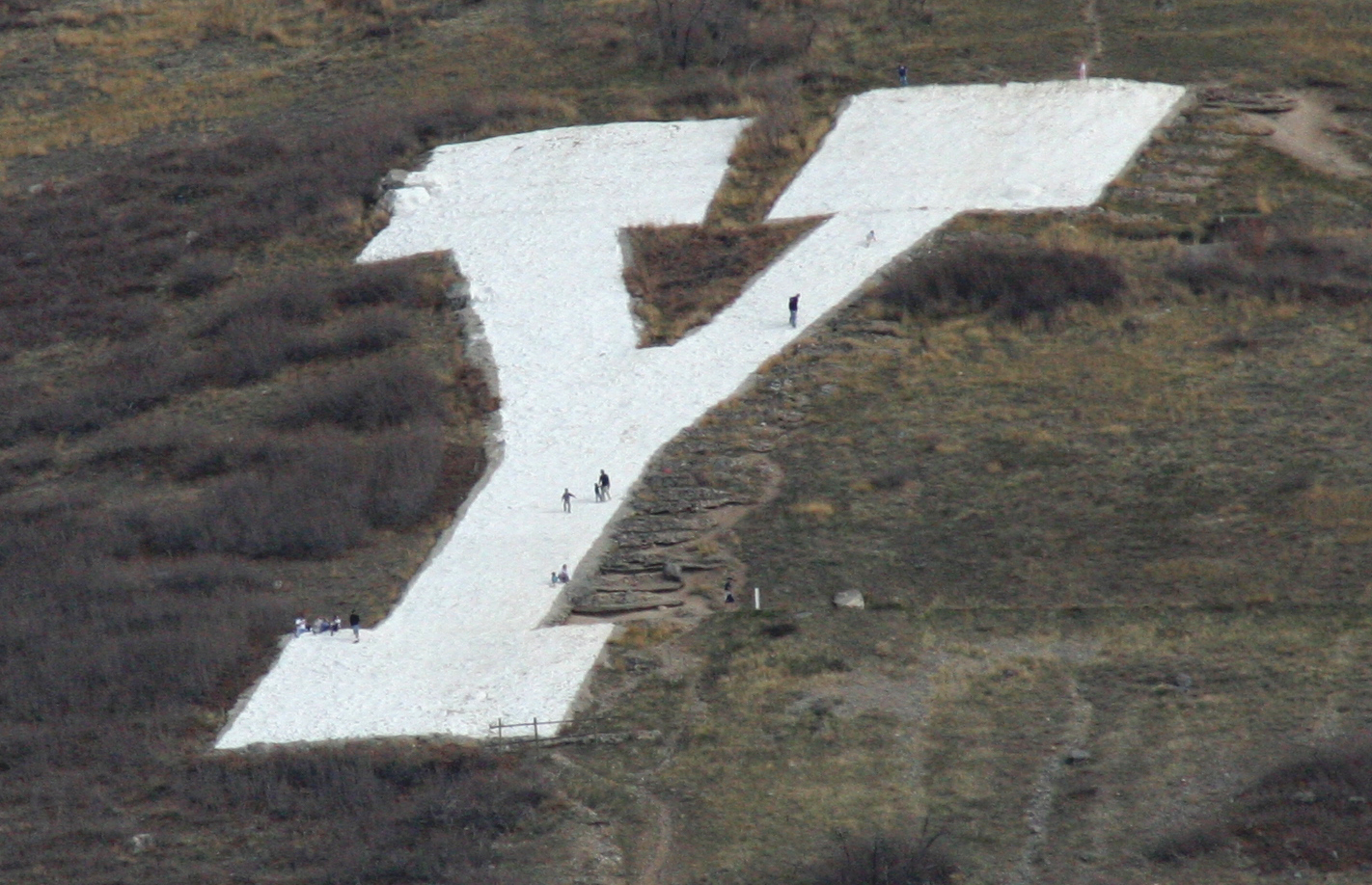
Yet the Big C had started something. Even then, Berkeley, for better or worse, was a model. By the next year, 1906, Brigham Young University had a Y two thousand feet above its Provo campus on the steepest part of Utah's Wasatch Front. This letter was 320 feet high, more than four times taller than the Berkeley C. Pack horses, and in later times helicopters, were used to reach it.
In the spring of 1907, the slopes behind the University of Utah overlooking the Salt Lake Valley sprouted a block U, again a pacification gesture among rival student groups. Popular Mechanics called it "the largest college monogram" although it was only half the height of the Y at Provo.
Three more college letters appeared in 1908. One was a one-hundred-foot M on Mount Zion behind the Colorado School of Mines at Golden. Here, as elsewhere, engineering students and faculty played a prominent role in the planning, and the construction day was declared a school holiday. Laying out the emblem on a twenty-three-degree slope so that it would be seen from the town as a perfect block letter was described as an instructive lesson in descriptive geometry. In true miner fashion, burros were used to move tools and materials to the construction site.
In the same year, less than one hundred miles north, Colorado A & M, now Colorado State University, built a much larger A for Aggies. In this case the link with earlier letters is documented. Students from Fort Collins traveled to Salt Lake City to inspect the new U at the University of Utah before beginning their own project. The A has persisted as a prominent Front Range landmark, although the institution's name has changed and its athletic teams are now known as the Rams.
Also in 1908 the University of Oregon at Eugene built the first of its block O's, a wooden structure on Skinner Butte near the railway station. It was later converted to concrete, and finally, in 1958, to metal. For many years Corvallis raiders visited the O, but today it is almost completely obscured from ground view by trees. Then came the flood tide. Between 1912 and 1915 at least eleven more western colleges and universities put letters on their mountains.
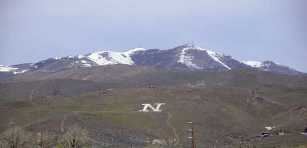
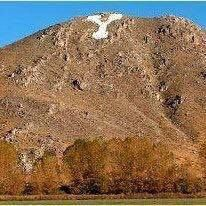
The University of Nevada students joined in with a geometrically perfect block N, 180 feet high, on Mt. Peavine overlooking the Truckee Meadows and Reno. "It isn't right," the student yearbook observed, "that Nevada spirit should show itself less plainly than California to the west or Utah to the east." As with the others, the project was a collective effort. Classes were canceled, a bucket brigade carried water and cement up the sagebrush-covered slope, and a women's auxiliary provided the picnic that always seemed to follow.
Between 1905 and 1915 at least twenty collegiate letters were built in the western states. Others came later.
Nevada Hillside Big Letters
Virtually every community along I-80 between Reno, Nevada, and Rock Springs, Wyoming, seems to have one.
High schools and a few junior colleges and grade schools followed the collegiate example, and today their letters vastly outnumber college letters. Several early ones were in Nevada, including the E at Elko, built in 1916 to honor a physical-education instructor who had lost his life in a snowstorm while leading a student group in the nearby Ruby Mountains. The T at Tonopah is lighted by a spotlight on the roof of the Mizpah Hotel. It celebrated the Nevada State Championship won by the Tonopah girls' basketball team in 1917. At Winnemucca, where a handsome W was built to honor another girls' championship team in 1920, a trust fund was set up to pay for periodic whitewashing, but, according to a recent report, "no one knows where the money is."
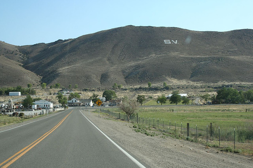
Other early Nevada high-school letters include the BM at Battle Mountain (1925), the V at Virginia City (1926), the L at Panaca, Lincoln County (1927), and the L at Lovelock (1931). The S at Sparks became a focus of controversy in the summer of 1985 when the ski manufacturer, Salomon-American, acquired the land on which it stood and redesigned the fifty-year-old symbol to resemble its corporate logo. In the face of community complaints, the company apologized and restored the letter to its original form.
In some cases, the new spray-can graffiti artists find these letters irresistible targets, to the dismay of student groups responsible for their upkeep. In earlier years students sometimes placed class numerals alongside letters. In August 1966, the citizens of Reno, Nevada, awoke to find the university's seventy-five-year-old N prefixed by a Greek sigma, the work of a college fraternity. Raids by groups from rival institutions armed with aerosols or cans of paint still enliven campus life.
The letter on the mountain is a subject without a literature. The map represents the author's personal observations over several years as well as the gleanings of students and associates who have joined the letter game. Additional examples will assuredly turn up. I predict that most will lie west of the hundredth meridian.
These monograms, usually of respectable antiquity, are part of community and landscape history. To some extent they reflect the spirit of the time when most were constructed, before environmental preservation and esthetics became concerns in our culture. Virtually all have been produced by student groups and represent their institutions. The letters remain a conspicuous and durable part of the identity of many communities, fortifying institutional allegiances and the sense of place. Occasionally they arouse antipathies among those who are offended by the intrusion of the human hand on often dramatic scenery. However, for travelers in the arid West the letters are "anchors to the eye," adding diversity and interest to the natural beauty of the landscape.
Hillside Letters in the Western Landscape by James J. Parsons
(Partial Reprint courtesy of Landscape, vol. 30, No. 1, 1988.) |
Man starts writing hillside message to win back ex-girlfriend ‘TINA’ – but gets tired and gives up
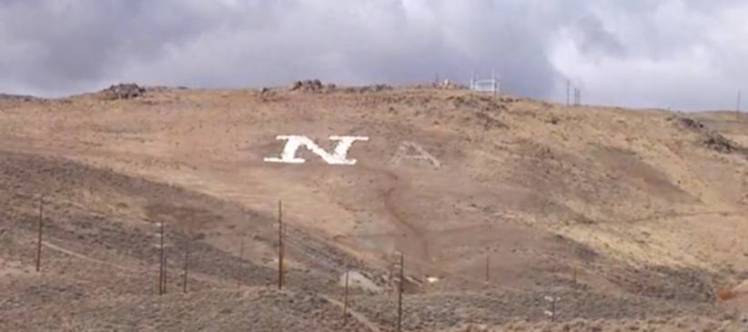
A mysterious ‘A’ written into a Nevada hillside beside the permanent ‘N’ was discovered to be part of a love message (Picture: KOLO News)
If you’re trying to win back an ex you might send flowers, a heartfelt mix tape or even try the classic stand-outside-the-house-and-shout-to-the-window move – but this wasn’t enough for one Nevada man.
Brent Wilbur’s attempt to win back his ex-girlfriend by carving her name into a large hillside was great in theory – but then he got tired and gave up.
For 100 years, a hill near Peavine Mountain in Reno, Nevada, has had a large ‘N’ etched in white rocks as a symbol for the University of Nevada.
Innovative Brent thought he would add some more lettering to spell out Tina’s name across the hillside as a declaration of his love.
Unfortunately, after spending five hours writing the letter ‘A’ in chalk next to the ‘N’, he got tired and left.
Local residents were quizzical about the mysterious capital letter which had suddenly appeared and traced the lazy love attempt back to Brent through his LinkedIn profile, which showed an image of the hillside message.

Lazy lover: Brent Wilbur tried to win back his ex with the hillside message – but tiredness took over ‘I rented a truck and bought a palette full of marking chalk, actually I bought all they had left,’ he told local media.
‘I was trying to write a woman’s name, “Tina”. I started with the ‘A’ and just ran out of steam.’
Tina, who Brent only dated for nine months four years ago, clearly left a mark on him as he said he had no regrets over the message – even if there may be legal consequences.
‘I owe her a great many apologies for the way I treated her,’ he added.
Luckily for Brent, local authorities have since said the letter does not violate any state codes and the University of Nevada believe nature will wash away the ‘A’ in its own time.
Sarah Kerr for Metro.co.uk Saturday 23 Nov 2013 12:18 pm
No comments:
Post a Comment